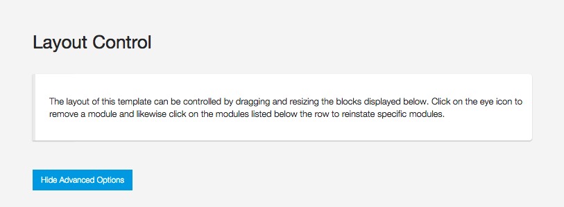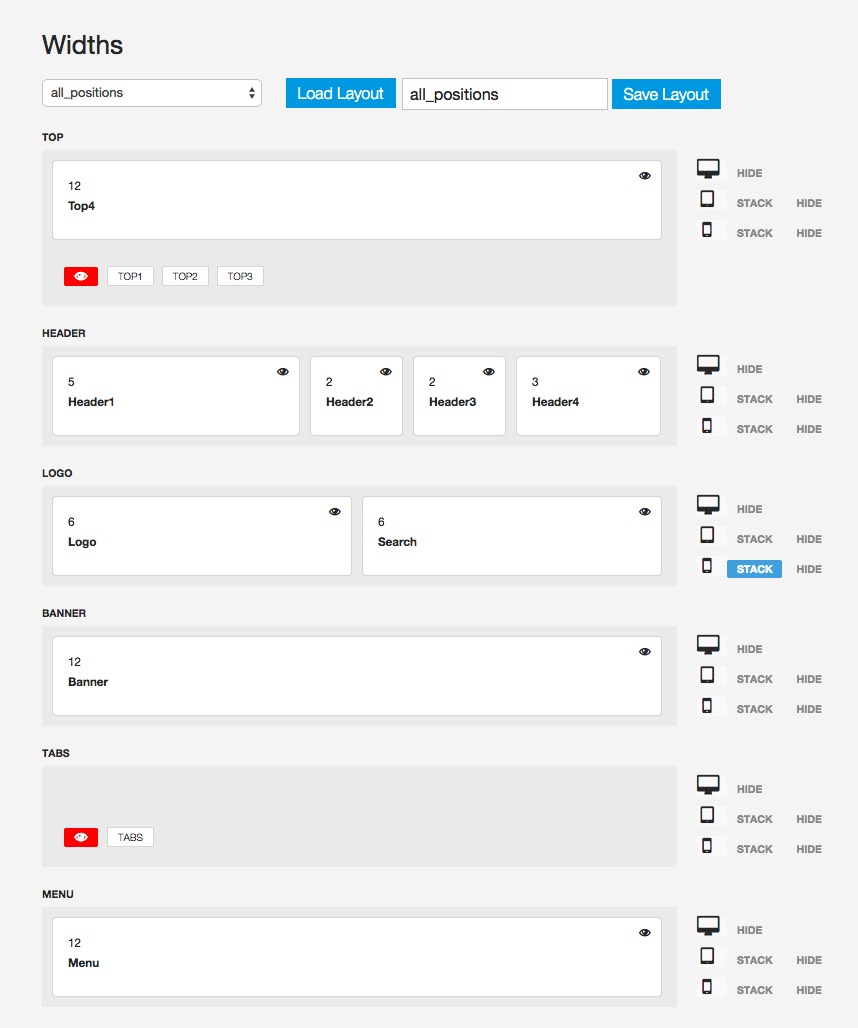
Zen Grid Framework V4 (ZGF4) themes come with a dedicated layout tool that lets you use a draggable interface to control the widths used for various modules in your template.
The Layout Panel
The layout tool is a single panel that control all of the layout rules across all screen sizes. You can easily determine the default behaviour for given rows across the various screen sizes available via the responsive breakpoints specified in your template settings.

The layout tool is inspired by the T3 Framework's layout tool with some key modifications in workflow. We have simplified the behaviour for the template across different screen sizes by adding simple toggles for either hiding or stacking modules at various screen sizes.
Mobile Detect Library
The template also features the possibility to use the Mobile Detect PHP library which is a blazingly fast library for determining whether or not to display content on a given tablet or mobile device. The Mobile detect library checks your layout tool settings and uses them to determine whether or not to load a row of content. Using the mobile detect library can significantly speed up your site's performance for mobile devices.